HOP DOG / AI VISUAL DIRECTION
AIforanofflinebrand
A gastropub entrance, window, menu, and website were reworked through AI-assisted visual direction: more light, more intrigue, and a clearer promise of what waits inside.
- AI
- visual concept direction
- 3
- offline surfaces
- 12
- reference signals structured
- WEB
- Tilda site cleanup
CONTEXT
Hidden inside. Quiet outside.
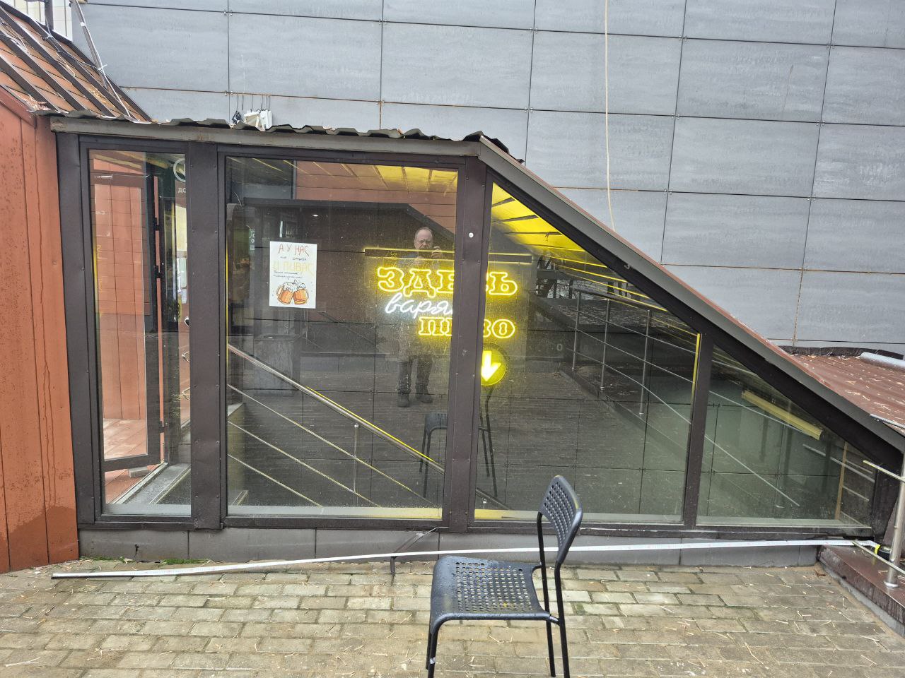
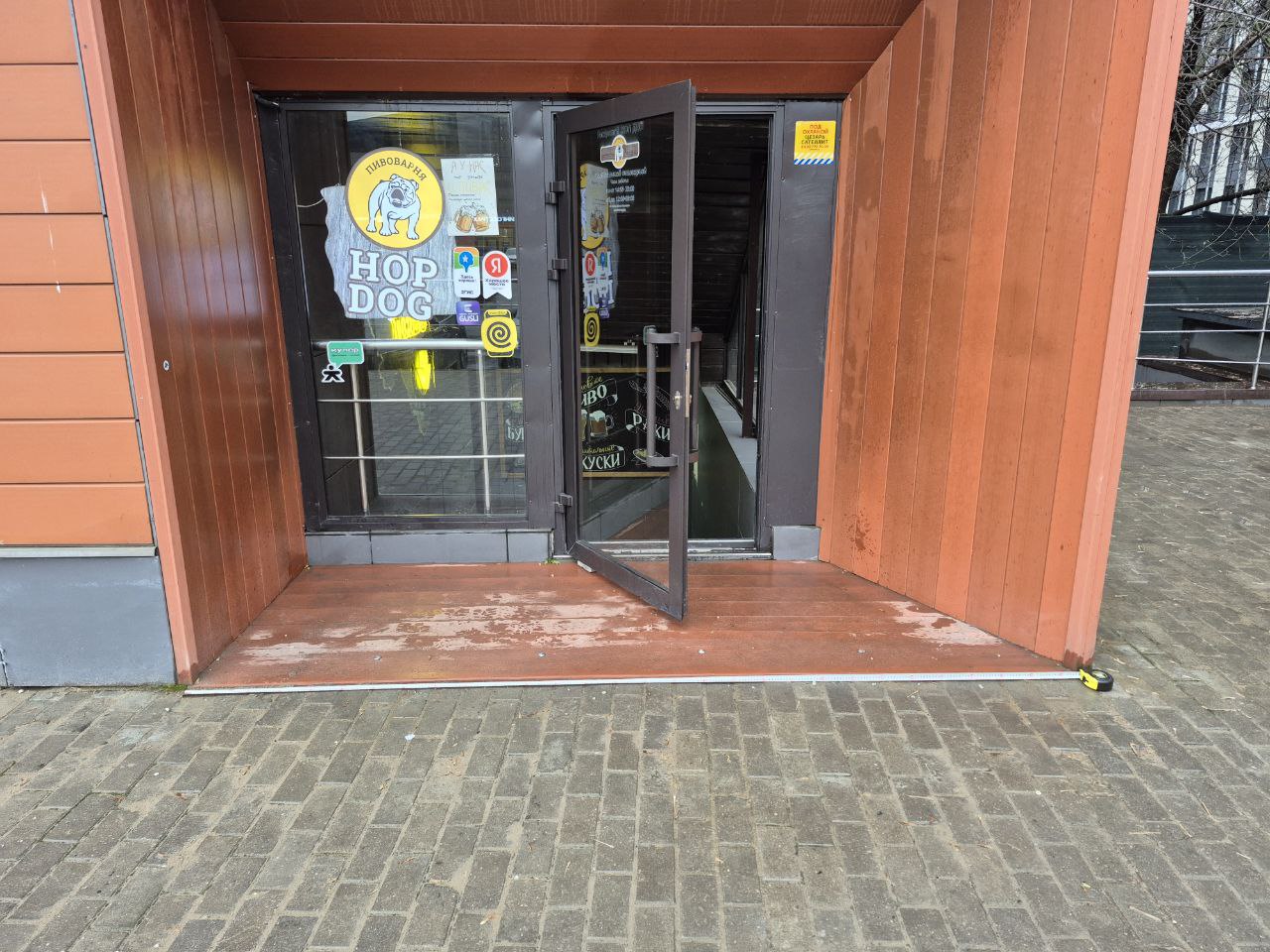
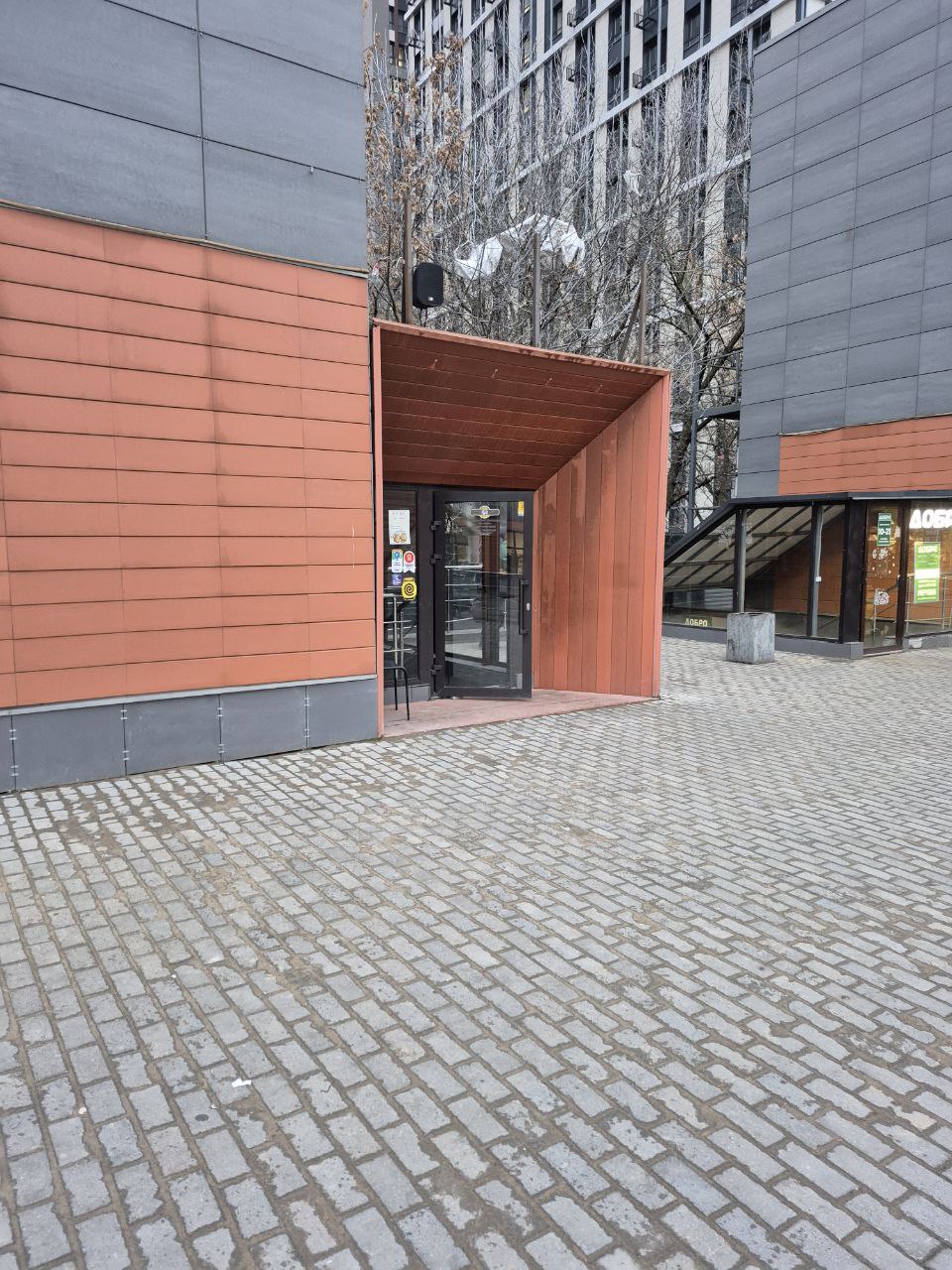
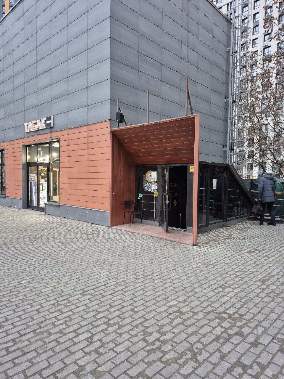
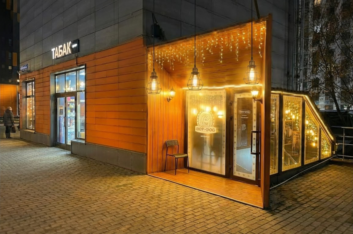
- 01The entrance was easy to missThe gastropub sits below street level, so the outside had to work harder than a regular sign.
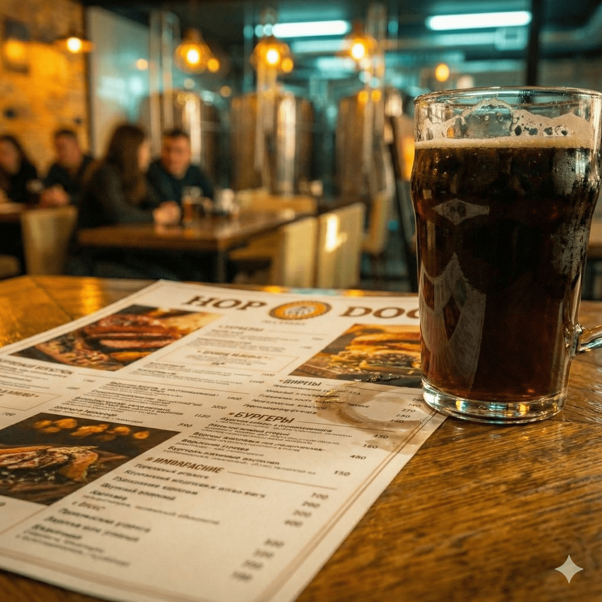
- 02The strongest asset was invisibleBeer tanks, fresh beer, and the brewery atmosphere were only understandable after someone had already gone in.
- 03The street was visually noisyThe entrance had to stand out through restraint, light, premium rhythm, and curiosity instead of louder signage.
- 04The website needed repairThe old Tilda site had readability issues, outdated design decisions, and technical debt.
APPROACH
Make the outside promise what is inside.
VISUAL AI PROOF
From a quiet basement door to a visible gastropub story
The case is visual-first: real location photos, reference signals, AI exterior concepts, AI menu atmosphere, and the repaired Tilda site are all kept large and uncropped.
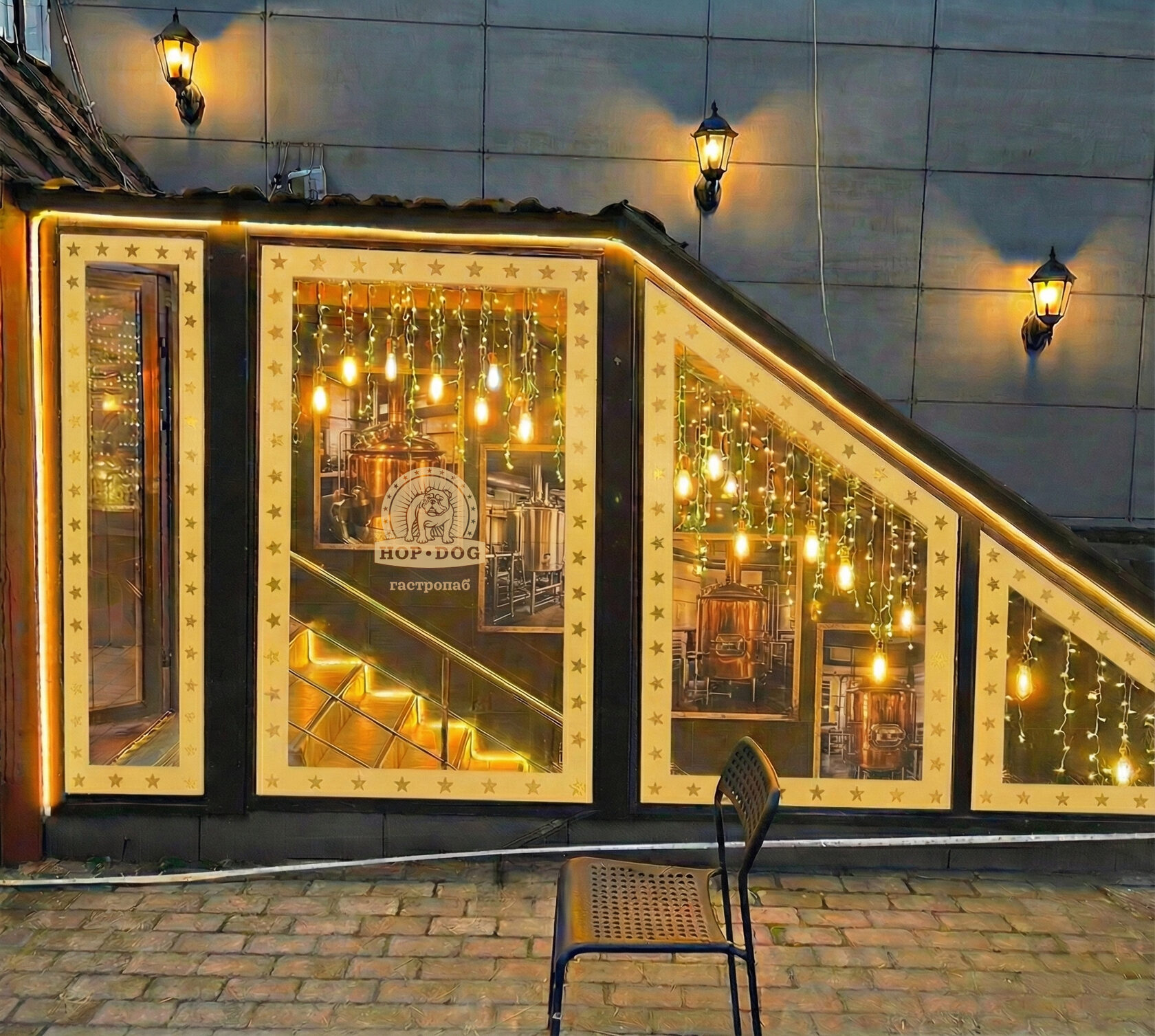
Before: the place had value, but the entrance did not tell it
The source material showed a real problem: the gastropub had a rich interior promise, but the street-level entrance was too quiet and fragmented.
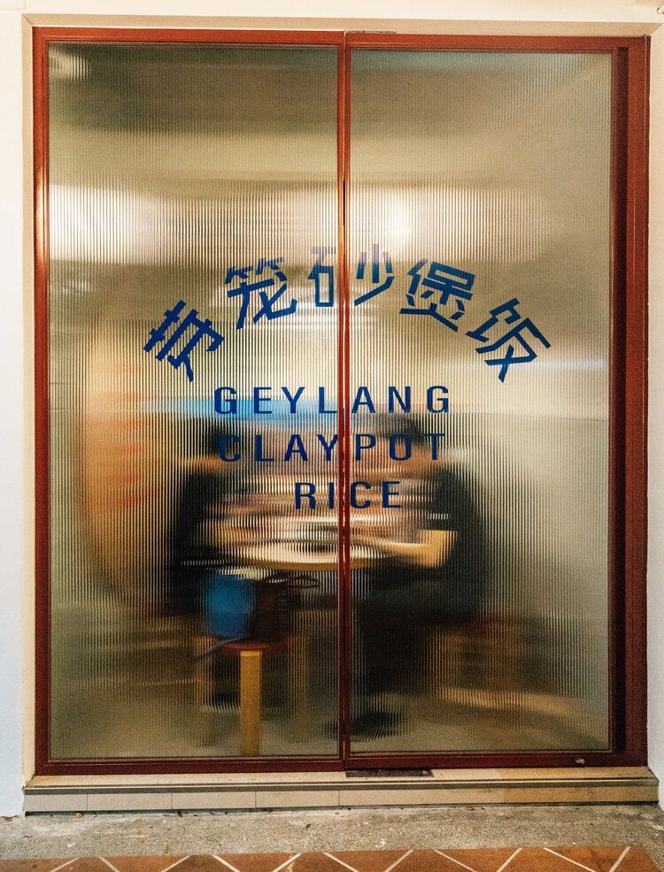
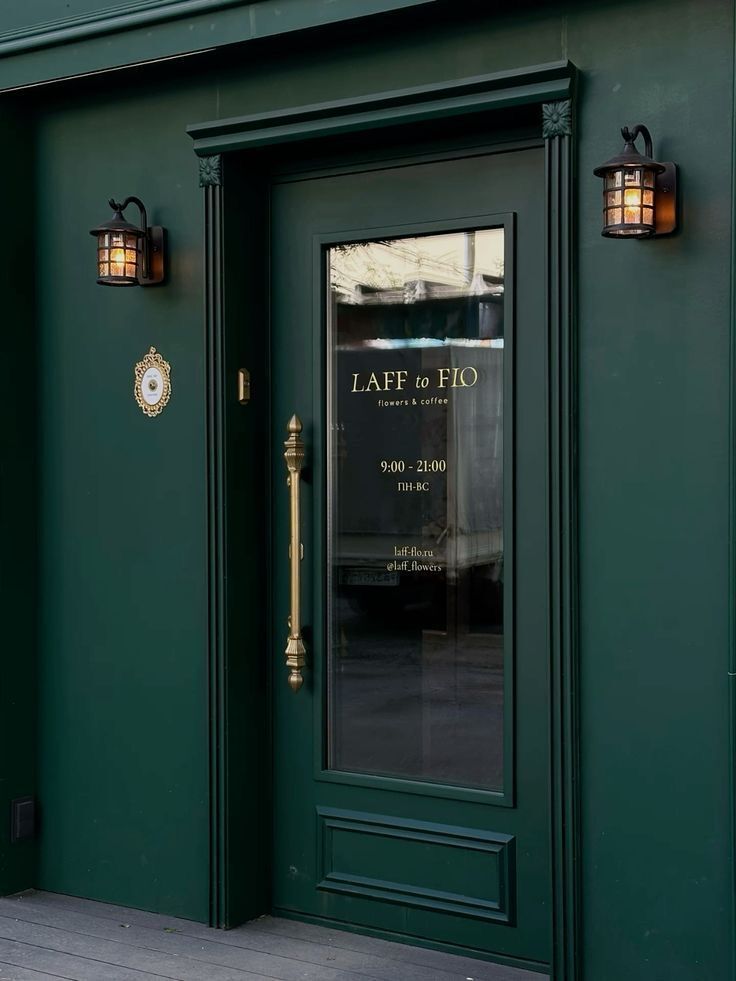
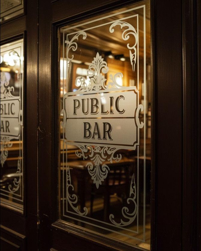
Reference signals converted into design criteria
References were not moodboard decoration. They became criteria: matte glass, warm vertical light, stair invitation, poster mood, and premium restraint without a classic sign.
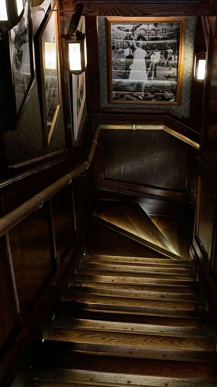
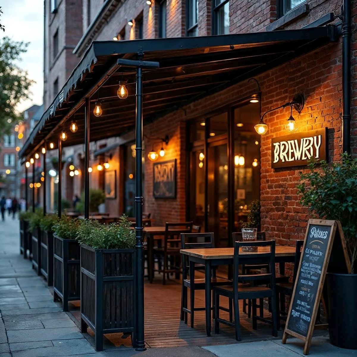
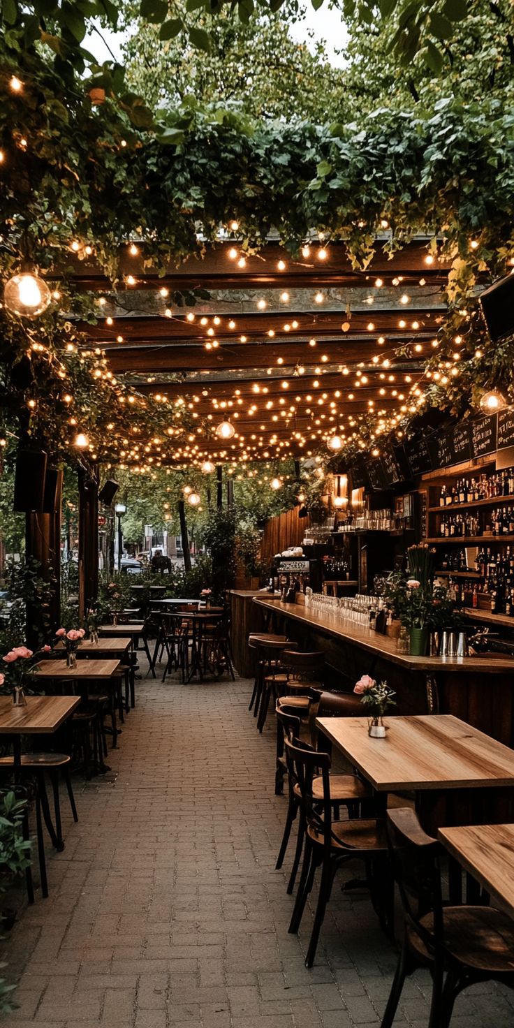
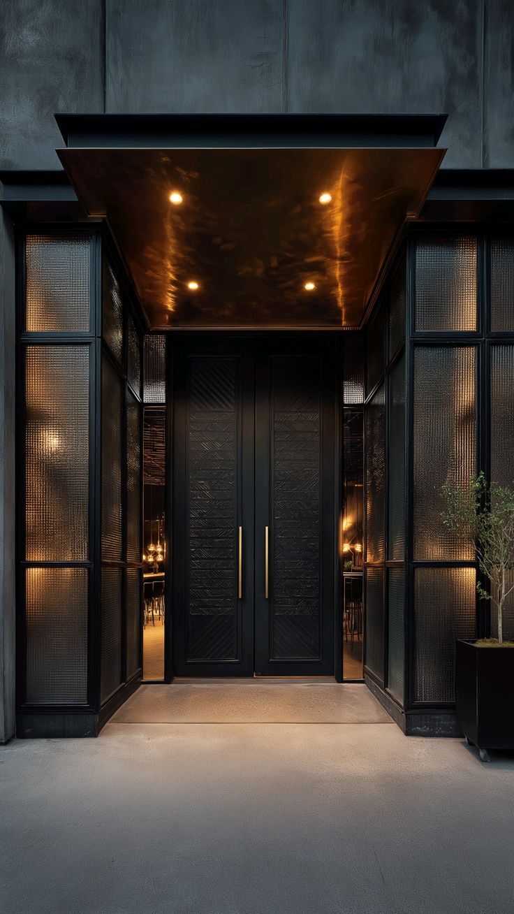
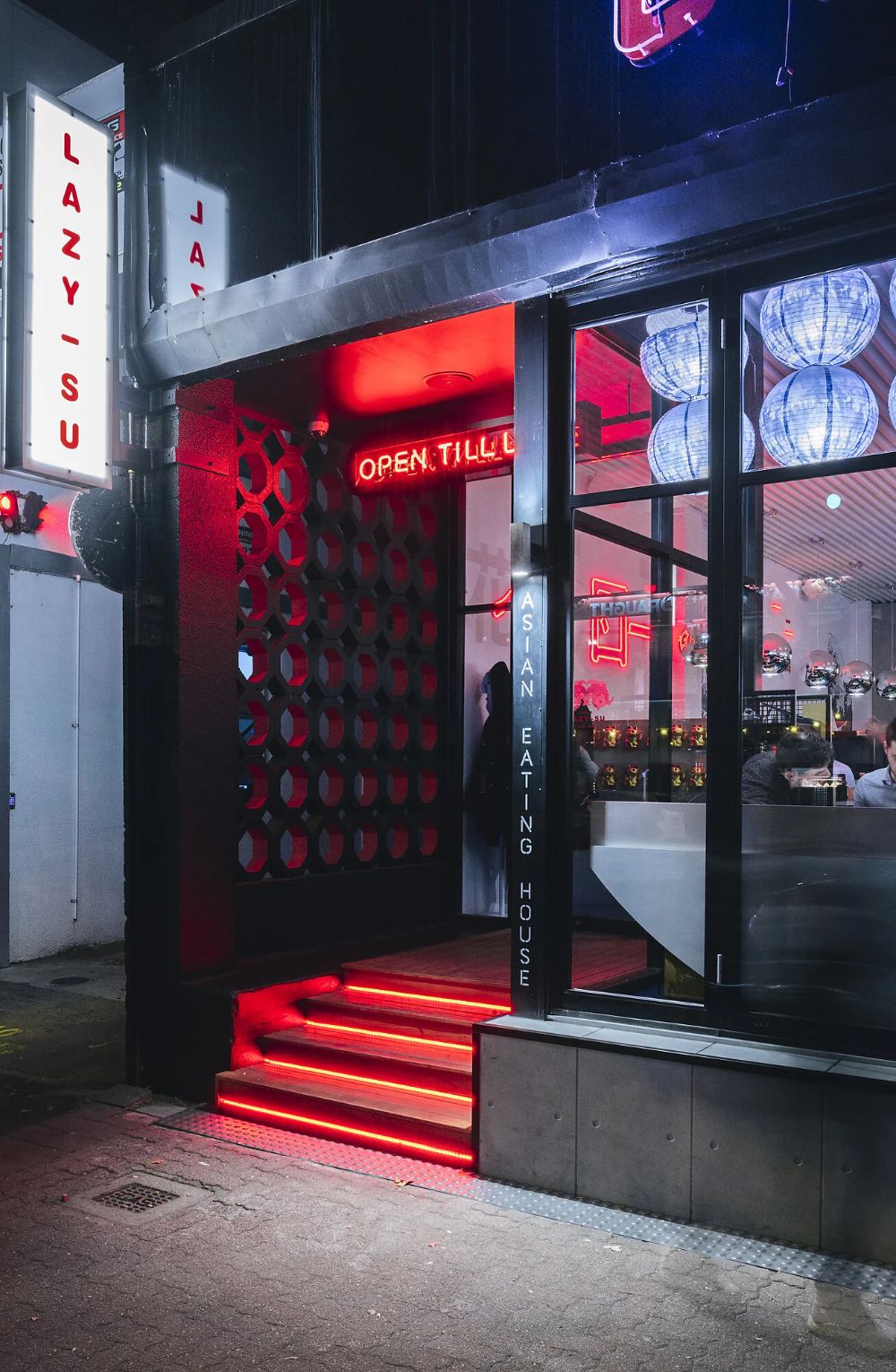
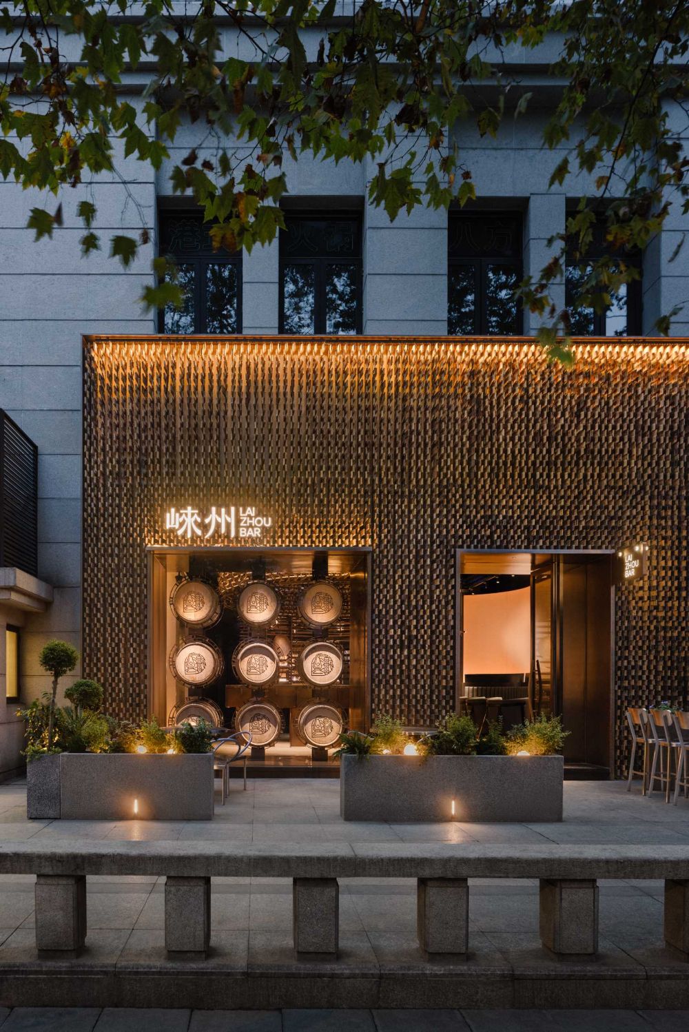
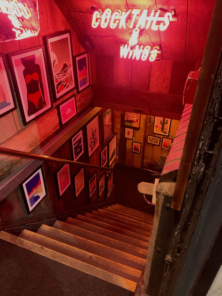
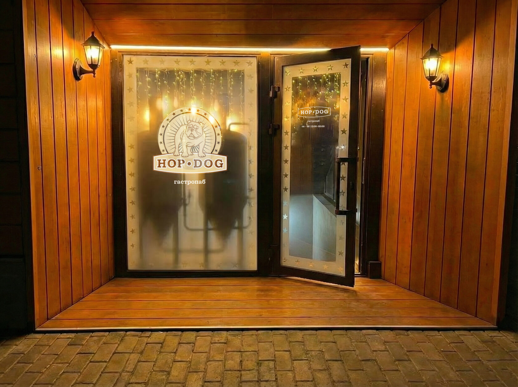
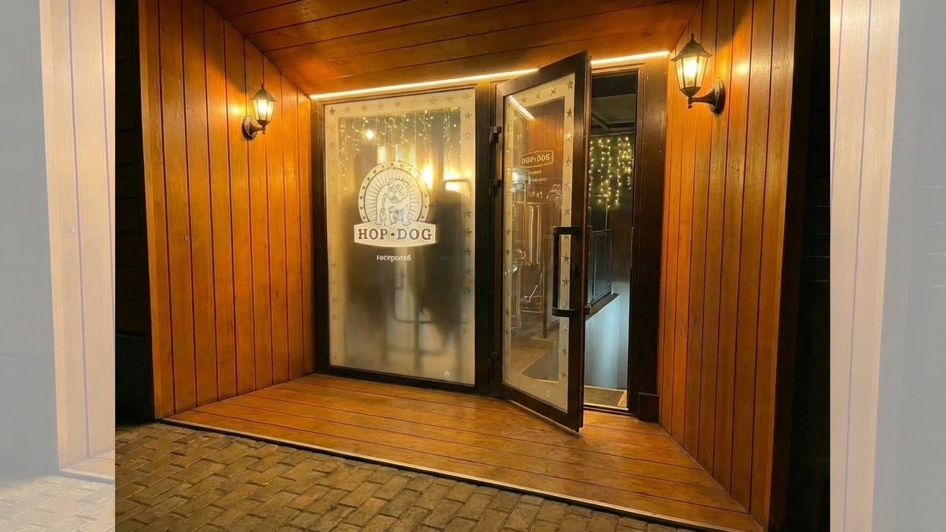
AI concept: light, tanks, matte glass, and a reason to look inside
AI helped assemble the direction quickly: tanks visible behind glass, warm bulbs, branded frames, stair light, and a more premium gastropub mood.

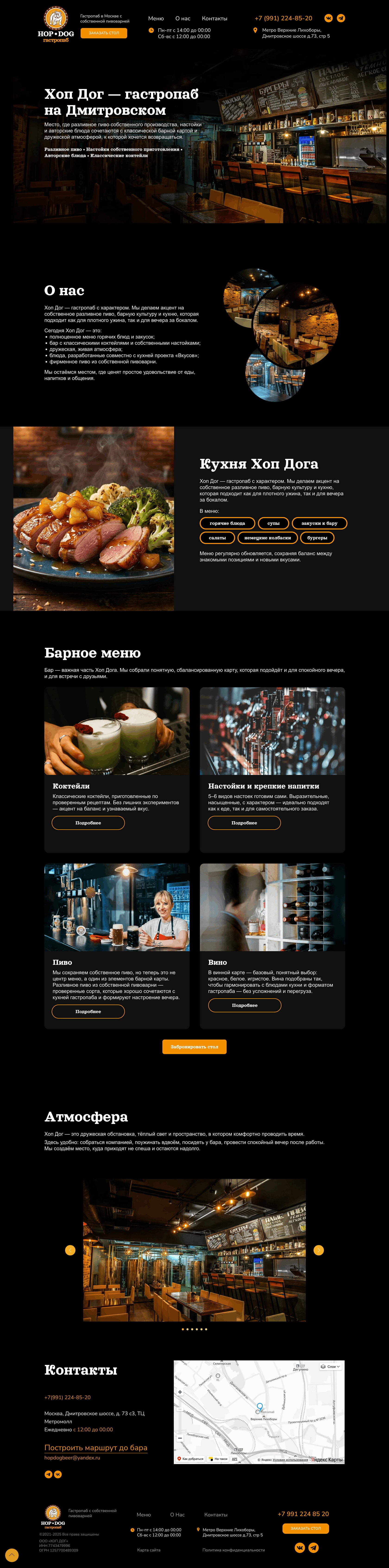
Website cleanup
The old Tilda site was repaired and visually aligned with the place: dark atmosphere, clearer sections, menu blocks, contact information, and fewer broken decisions.
PROCESS
AI was useful because the task was spatial and atmospheric.
The work moved from real constraints to visual criteria, then to AI concepts and practical surfaces.
- 01Read the placeEntrance, side window, basement route, street noise, and hidden beer tanks were mapped as design constraints.
- 02Extract criteriaReferences were translated into rules: warmth, matte glass, light rhythm, intrigue, and visual restraint.
- 03Generate and selectAI concepts were used to test combinations quickly, while taste and feasibility filtered the result.12visual signals3offline zones
- 04Apply to surfacesThe chosen direction shaped the entrance idea, window logic, lighting mood, menu visuals, and Tilda site repair.
RESULTA clearer offline storyThe brand stopped relying only on what guests discover inside. The outside began to hint at the tanks, beer, warmth, and gastropub atmosphere.
OUTPUT
A visible AI-assisted brand environment
- 01Facade directionA concept for glass, light, frames, logo, side window, and stair rhythm.
- 02AI visual languageA warmer image system for beer, menu, tanks, and gastropub atmosphere.
- 03Website repairA cleaned-up Tilda page with clearer reading, structure, and visual tone.
Ready to make it visible?
If your offline brand has more value inside than people can see outside, write to me on Telegram.
Write on Telegram