FINTECH / TRADING PLATFORM
Tradingplatformredesign
A full redesign of the trading ecosystem: public landings, trader cabinet, charts, tools, social trading, copy strategies, design system, and team standards.
- Trading
- platform for trading
- 3+
- products inside the system
- 16
- interface languages
- 10+
- landing pages
CONTEXT
Trust before scale.
- 01Fragmented visual stylesThe product looked assembled by different hands, without one interface language or component logic.
- 02Low trust in a financial interfaceOld screens felt too technical and uneven, which is dangerous for a product dealing with money and risk.
- 03Complex trader cabinetCharts, tools, profiles, copy trading, and account actions needed a clearer hierarchy and stronger sense of control.
- 04No shared standards for the teamLanding pages, app flows, and product communication needed one system, not isolated redesign moments.
APPROACH
A financial interface needs structure, speed, and a visible sense of control.
DESIGN PROOF
Screens, dashboards, trader profiles, landing pages, and product standards
All visual assets from the case are kept large and uncropped: the value is in the full system, not in a small preview.
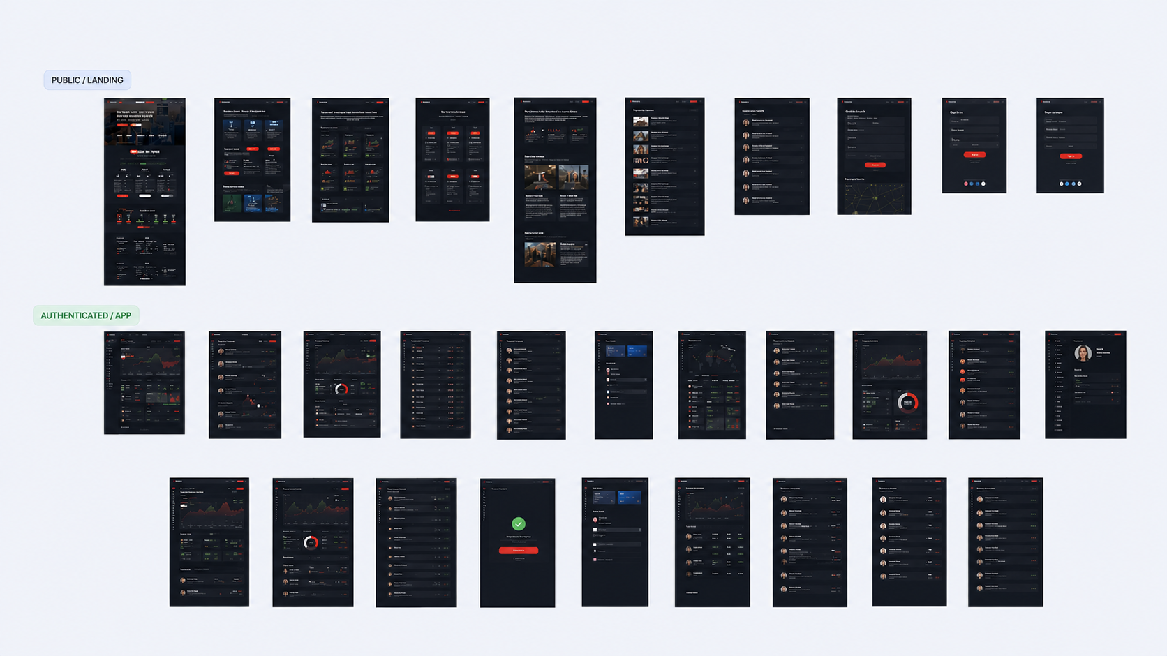
Product scope and screen map
The work covered both public landing surfaces and authenticated product screens. The map shows how broad the redesign became.
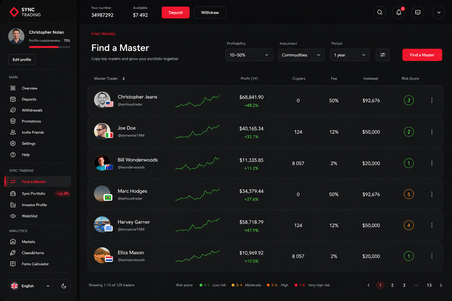
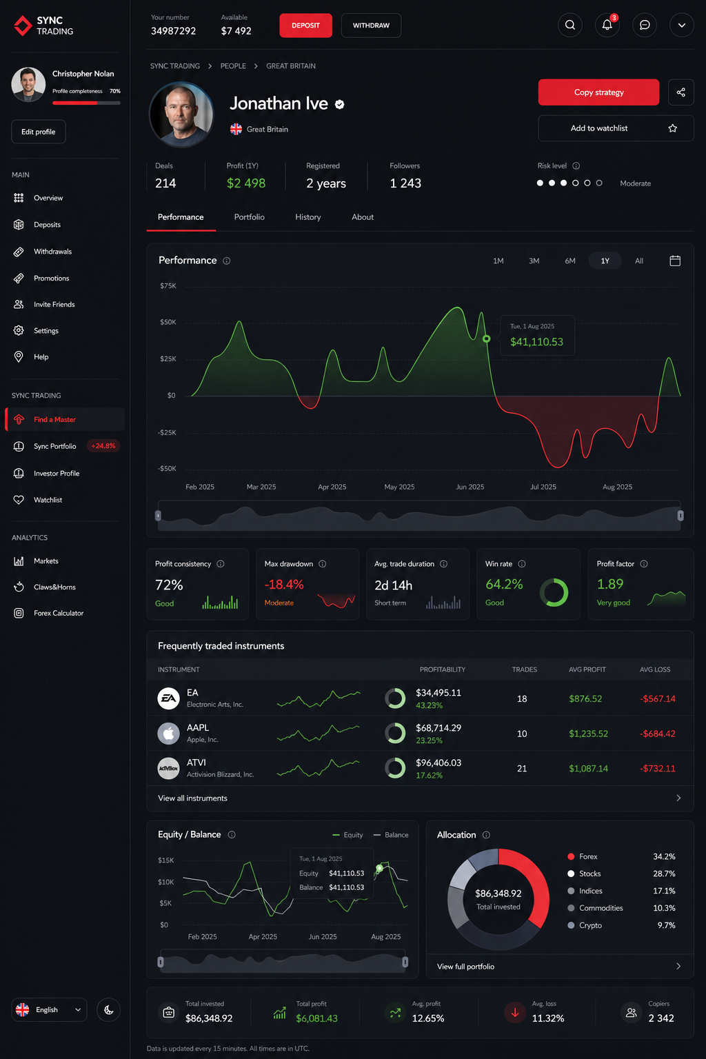
Trading cabinet and copy strategy screens
The cabinet needed to feel precise and controlled: portfolio signals, master traders, profitability, risk, copied strategies, and action states.
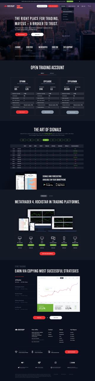
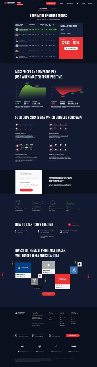
Landing system and marketing surfaces
The redesign also touched the public side: acquisition pages, account packages, copy-trading explanation, calculators, and conversion blocks.
MY ROLE
I rebuilt the platform from scattered screens into a controlled product system.
My role covered interface redesign, product logic, design-system decisions, visual standards, and team enablement.
- 01Audited the ecosystemI separated public landings, authenticated app flows, trading tools, copy-strategy mechanics, and communication surfaces into a manageable structure.
- 02Redesigned the trading cabinetKey app screens were rebuilt around comparison, risk, action clarity, financial confidence, and repeated interface patterns.
- 03Built shared UI standardsThe system aligned dark surfaces, tables, charts, filters, buttons, forms, navigation, cards, statuses, and multilingual interface behavior.
- 04Connected marketing and productPublic landing pages and app surfaces started to speak one product language, instead of looking like separate projects.
- 05Trained the teamI helped the team work by shared standards so the platform could stay consistent after the initial redesign.
RESULTA more consistent and trusted trading ecosystemUI quality and consistency improved across the platform; with that, trust and product activity grew, using operations and deals as a proxy signal.
OUTPUT
What changed
- 01Full ecosystem redesignFrom marketing pages to trader cabinet, charts, tools, social mechanics, and copy strategies.
- 02Design system and visual standardsA shared foundation for dark fintech UI, multilingual screens, app states, and reusable product patterns.
- 03Clearer trader workflowsComparison, risk, profile data, profitability, and account actions became easier to scan and trust.
- 04Stronger team consistencyThe team received standards and training that reduced visual drift across products and landings.
Ready to start?
If you have questions about this case or want to bring your own project, write to me on Telegram.
Write on Telegram